registered trademark

These brand guidelines serve as the foundational blueprint for our organization–the “rules of engagement” for how we communicate our brand to the world. They are designed to be a resource to ensure that our voice remains consistent, compelling and perfectly aligned with our singular goal: to build a foundation of hope.

Download Full Brand Guidelines

Contents

  1. 01 Brand Strategy

  2. 02 Personality

  3. 03 Logo

  4. 04 Color

  5. 05 Typography

  6. 06 Art Direction

  7. 07 Resources

>>01

Brand Strategy

WHY

We are called to serve those who have served us.

HOW

With a servant’s heart, we provide professionally-built homes and home modifications to restore independence and safety to those who have served our country.

WHAT

Operation Finally Home delivers life-changing, mortgage-free homes and home modifications to America’s veterans, first responders and surviving spouses. With our team of professionals with expertise across military and construction industries, we build a place of peace where they can feel their freedom, strength and honor is restored.

>>02

Personality

Our brand voice is the expression of our personality in words. We maintain a consistent voice for all audiences (veterans, donors, partners and the public).

We speak like a trusted peer and an expert advocate. Our tone is knowledgeable but approachable, firm but compassionate. We are direct and clear. Like a briefing, we get to the point. We avoid flowery language or complex jargon unless necessary for precision.
Tone & Voice

Our Vision: Why We Exist

Operation Finally Home is a nonprofit organization called to transform veterans’ lives through the foundation of a safe, comfortable and accessible home.

Our Mission: What We Do

At Operation Finally Home, we build a foundation of hope for America’s veterans, first responders and surviving spouses by providing mortgage-free homes and life-changing home modifications, meeting one of their most critical needs–a safe place to call home.

Our Promise: How We Help

Our team of professionals, with expertise across construction industries and the military, provide individualized housing solutions to meet the unique needs of veterans from every era of military service and war.

Sample Copy

Resolute and Fiercely Committed

We don't waver, get complacent, or settle for partial solutions. From groundbreaking to key handover, our commitment is total, dependable, and built to stand the test of time.

Transformative, Not Corporate

We bypass rigid bureaucratic jargon and wasteful processes. We deliver real, fundamental change tailored specifically to the physical needs and daily lives of injured veterans and first responders.

Unapologetic Advocacy

We do not apologize for our conviction or our focused mission. Our tone is firm, direct, and unyielding because the heroes we support deserve nothing less than our total strength.

A Calling, Not Just a Job

We operate with a profound sense of mandate. Providing mortgage-free homes and modifications isn't just a charitable option—it is a duty derived from the deep sacrifices made by those we serve.

>> 03

Logo

Our brand system is more than a logo; it is the visual architecture of our promise.

For our veterans and first responders, this consistency

builds trust. For our partners, it represents a professional standard of excellence.

Good design ensures that when a hero looks for help, they recognize a home before a single brick is even laid.

Primary Lockup

Clearspace

Secondary Lockups

Image of secondary brand logo

Incorrect Usage

Image of brand logo incorrectly sized

Do not distort or skew our logo.

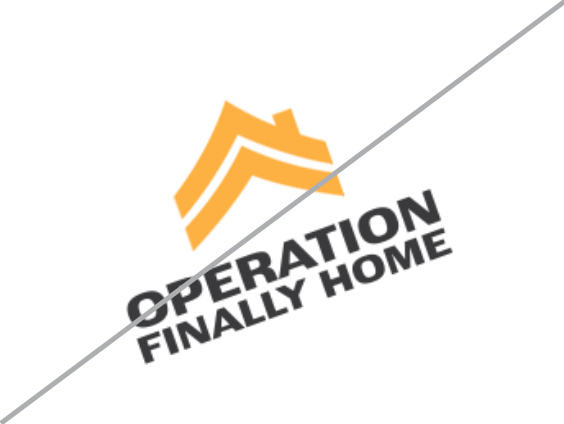
Image of brand logo incorrectly rotated

Do not rotate the logo

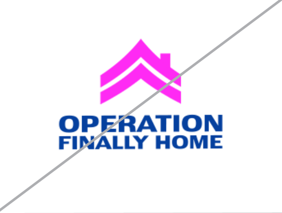
Image of brand logo incorrectly colored

Do not change the color of the mark alone

Image of brand logo incorrectly outlined

Do not outline the logo

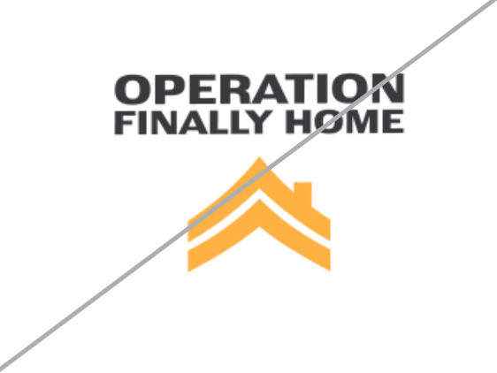
Image of brand logo incorrectly ordered

Do not reverse the lockup

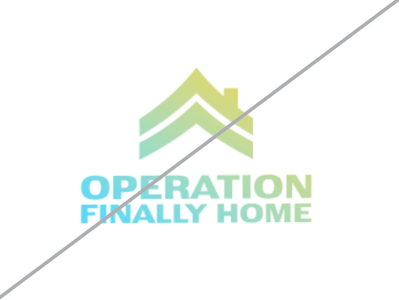
Image of brand logo incorrectly using gradients

Do not add gradients the logo

>> 04

Color

Consistent color usage strengthens brand recognition, builds trust, and creates a cohesive experience across every touchpoint. While primary colors serve as the core visual foundation of the brand, secondary and tertiary colors have been selected to support and enhance the palette—adding flexibility, depth, emphasis, and visual interest without overshadowing the primary identity.

Primary Palette

Gold Medal

Hex: #FDAF42

Concrete

Hex: #404041

Picket Fence

Hex: #FFFFFF

Secondary Palette

Concrete

Hex: #7A7975

Khaki

Hex: #BEA690

Charcoal

Hex: #2D2E2E

Tertiary Palette

Lumber

Hex: #6E5439

Steel

Hex: #BAB8B0

New Lawn / UI

Hex: #00000C

Patterns

Charcoal & Slate Chevron

Camo

>> 05

Typography

A typography system to provide a clear hierarchy and structure, ensuring every message is legible and reflects the strength of our brand.

Primary Typeface

Secondary Typeface

Lato

On the Web

Text Lockups

Metric Cards

>> 06

Art Direction

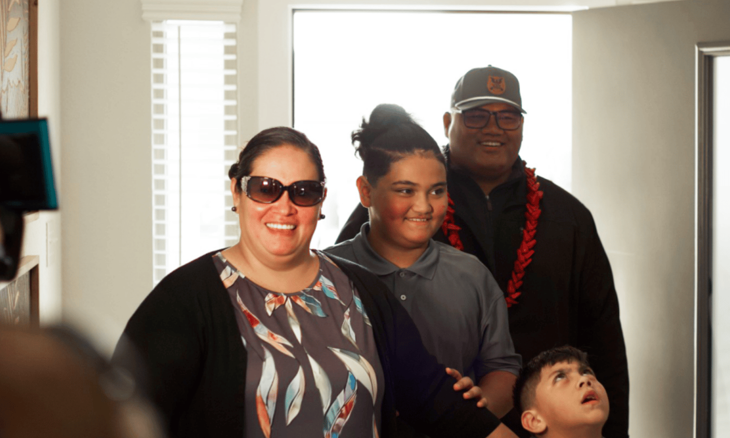
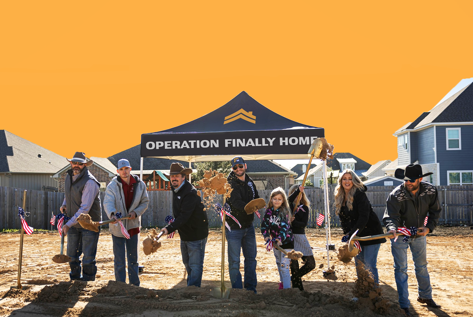
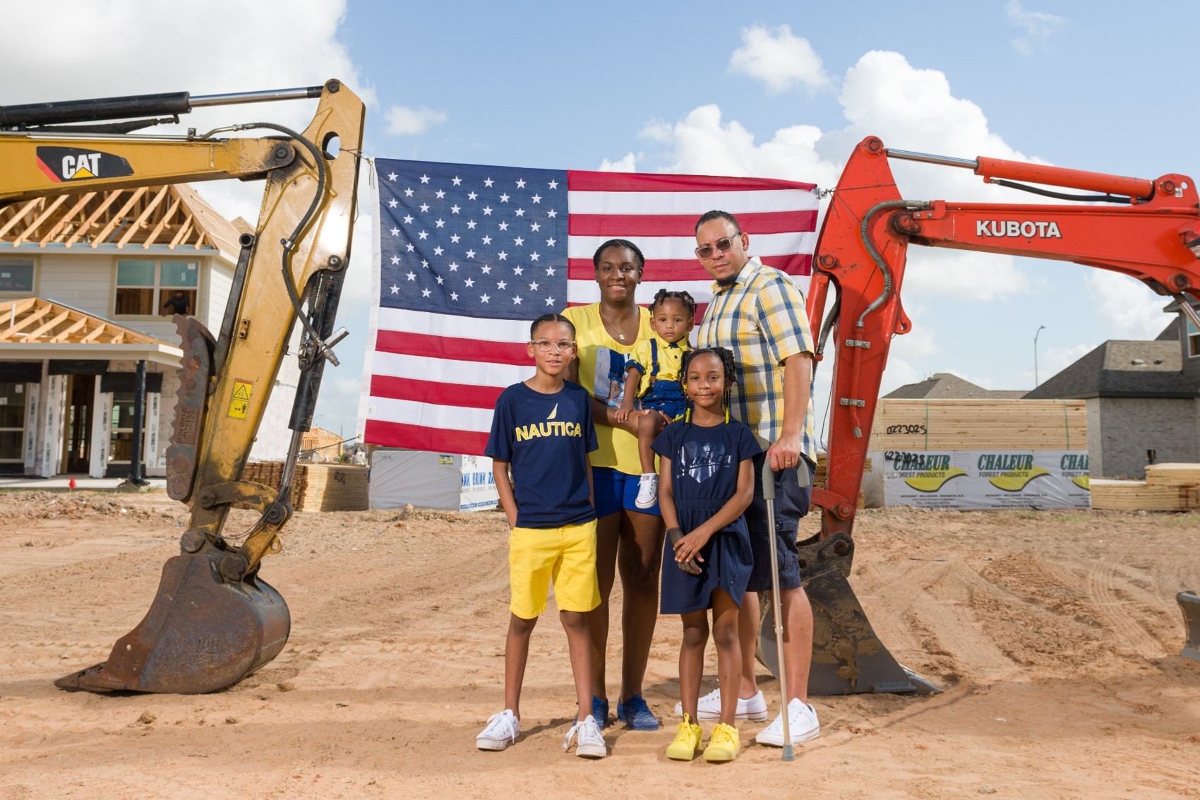
The greatest way to show gratitude for service is to ensure the life that follows it is lived in full color. Our photography should feel active, not archival.

By utilizing high contrast and a vibrant, saturated palette, we visually signal the transition from the uniform to the individual bringing the “human-ness” of our

families into sharp focus.

Contrast

Favor deep charcoal and bright whites. This adds “weight” to the image, honoring the strength of our heroes. Avoid “flat” lighting.

Saturation

Boost the warmth ever so slightly. We want skin tones to look vital and landscapes to look lush. Color is our proof of life; it’s how we show that the “gray” of transition has been replaced by the “vividness” of life at home.

>> 07

Resources

KITS

Download Media Kit

NEWSLETTERS

Download July Homefront Newsletter

These brand guidelines serve as the foundational blueprint for our organization–the “rules of engagement” for how we communicate our brand to the world. They are designed to be a resource to ensure that our voice remains consistent, compelling and perfectly aligned with our singular goal: to build a foundation of hope.

Download Full Brand Guidelines

Contents

  1. 01 Brand Strategy

  2. 02 Personality

  3. 03 Logo

  4. 04 Color

  5. 05 Typography

  6. 06 Art Direction

  7. 07 Resources

>> 01

Brand Strategy

WHY

We are called to serve those who have served us.

HOW

With a servant’s heart, we provide professionally-built homes and home modifications to restore independence and safety to those who have served our country.

WHAT

Operation Finally Home delivers life-changing, mortgage-free homes and home modifications to America’s veterans, first responders and surviving spouses. With our team of professionals with expertise across military and construction industries, we build a place of peace where they can feel their freedom, strength and honor is restored.

>>02

Personality

Our brand voice is the expression of our personality in words. We maintain a consistent voice for all audiences (veterans, donors, partners and the public).

We speak like a trusted peer and an expert advocate. Our tone is knowledgeable but approachable, firm but compassionate. We are direct and clear. Like a briefing, we get to the point. We avoid flowery language or complex jargon unless necessary for precision.

Tone & Voice

Our Vision: Why We Exist

Operation Finally Home is a nonprofit organization called to transform veterans’ lives through the foundation of a safe, comfortable and accessible home.

Our Mission: What We Do

At Operation Finally Home, we build a foundation of hope for America’s veterans, first responders and surviving spouses by providing mortgage-free homes and life-changing home modifications, meeting one of their most critical needs–a safe place to call home.

Our Promise: How We Help

Our team of professionals, with expertise across construction industries and the military, provide individualized housing solutions to meet the unique needs of veterans from every era of military service and war.

Sample Copy

A Calling, Not Just a Job

We operate with a profound sense of mandate. Providing mortgage-free homes and modifications isn't just a charitable option—it is a duty derived from the deep sacrifices made by those we serve.

Unapologetic Advocacy

We do not apologize for our conviction or our focused mission. Our tone is firm, direct, and unyielding because the heroes we support deserve nothing less than our total strength.

Transformative, Not Corporate

We bypass rigid bureaucratic jargon and wasteful processes. We deliver real, fundamental change tailored specifically to the physical needs and daily lives of injured veterans and first responders.

Resolute and Fiercely Committed

We don't waver, get complacent, or settle for partial solutions. From groundbreaking to key handover, our commitment is total, dependable, and built to stand the test of time.

>> 03

Logo

Our brand system is more than a logo; it is the visual architecture of our promise.

For our veterans and first responders, this consistency

builds trust. For our partners, it represents a professional standard of excellence.

Good design ensures that when a hero looks for help, they recognize a home before a single brick is even laid.

Primary Lockup
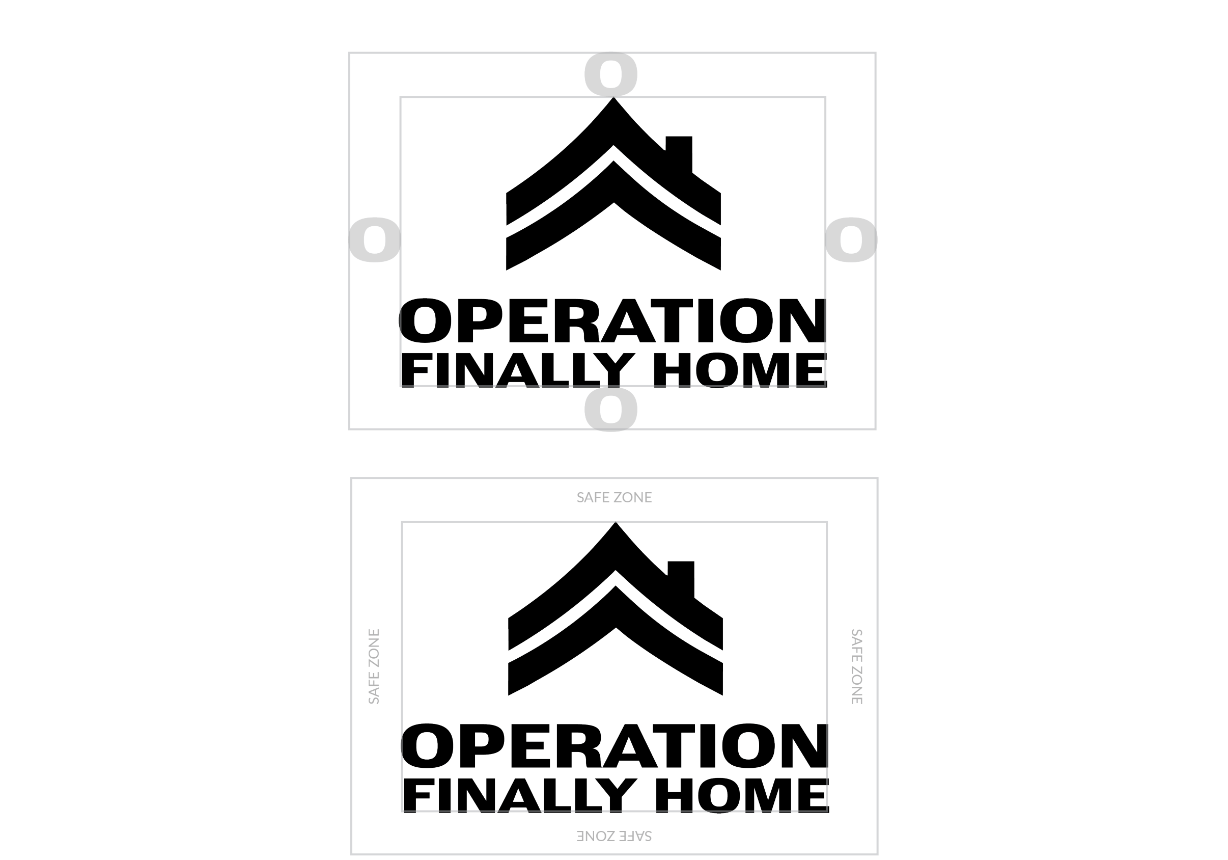
Clearspace
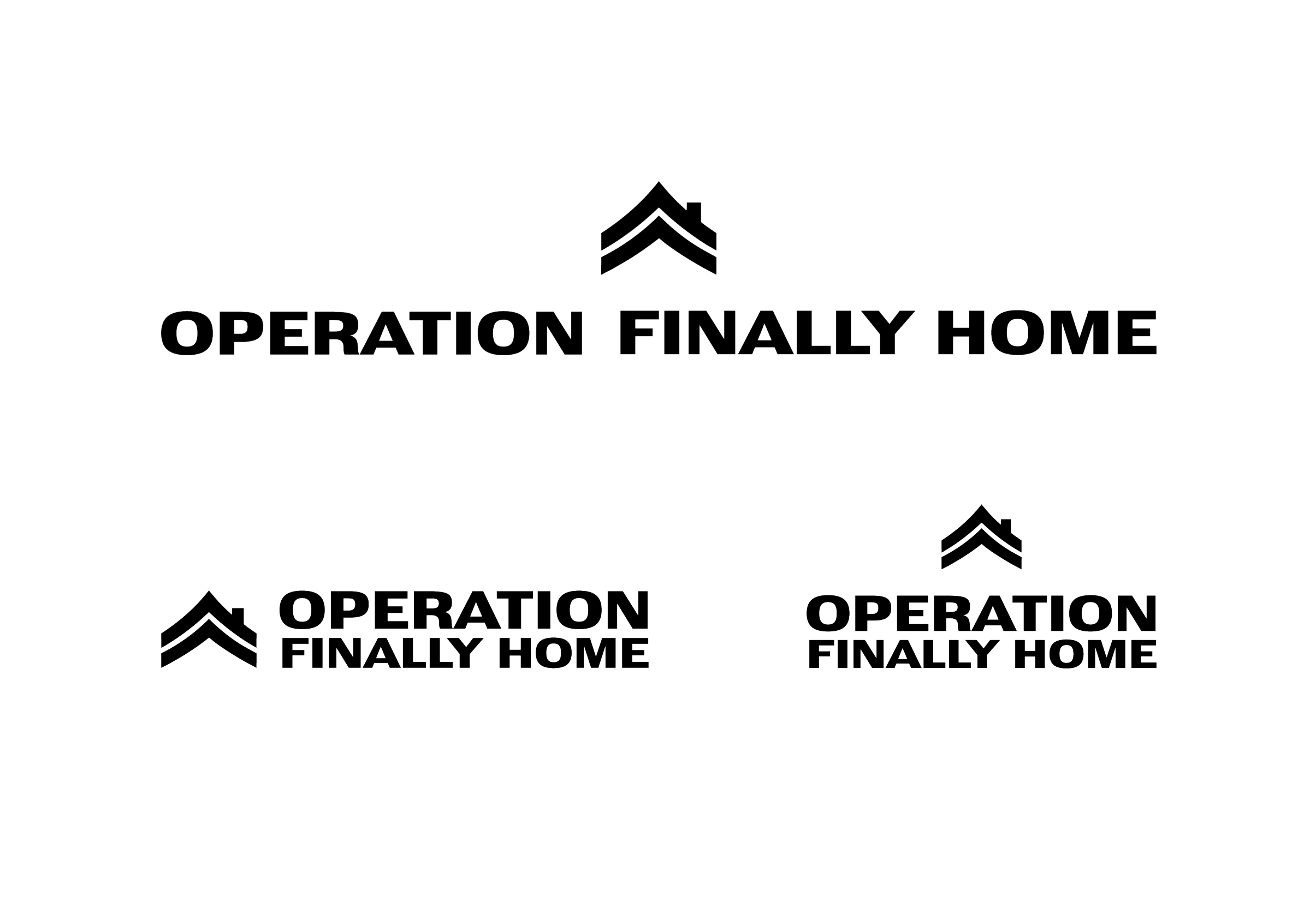
Secondary Lockups
Incorrect Usage
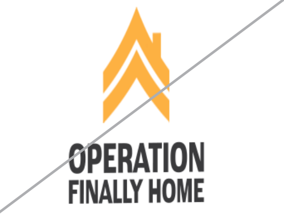
Image of brand logo incorrectly sized

Do not distort or skew our logo.

Image of brand logo incorrectly rotated

Do not rotate the logo

Image of brand logo incorrectly colored

Do not change the color of the mark alone

Image of brand logo incorrectly outlined

Do not outline the logo

Image of brand logo incorrectly ordered

Do not reverse the lockup

Image of brand logo incorrectly using gradients

Do not add gradients the logo

>> 04

Color

Consistent color usage strengthens brand recognition, builds trust, and creates a cohesive experience across every touchpoint. While primary colors serve as the core visual foundation of the brand, secondary and tertiary colors have been selected to support and enhance the palette—adding flexibility, depth, emphasis, and visual interest without overshadowing the primary identity.

Primary Palette

Gold Medal

Hex: #FDAF42

Concrete

Hex: #404041

Picket Fence

Hex: #FFFFFF

Secondary Palette

Concrete

Hex: #7A7975

Khaki

Hex: #BEA690

Charcoal

Hex: #2D2E2E

Tertiary Palette

Lumber

Hex: #6E5439

Steel

Hex: #BAB8B0

New Lawn / UI

Hex: #00000C

Patterns

Charcoal & Slate Chevron

Camo

>> 05

Typography

A typography system to provide a clear hierarchy and structure, ensuring every message is legible and reflects the strength of our brand.

Primary Typeface

Secondary Typeface

Lato

On the Web

Text Lockups

Metric Cards

>> 06

Art Direction

The greatest way to show gratitude for service is to ensure the life that follows it is lived in full color. Our photography should feel active, not archival.

By utilizing high contrast and a vibrant, saturated palette, we visually signal the transition from the uniform to the individual bringing the “human-ness” of our

families into sharp focus.

Contrast

Favor deep charcoal and bright whites. This adds “weight” to the image, honoring the strength of our heroes. Avoid “flat” lighting.

Saturation

Boost the warmth ever so slightly. We want skin tones to look vital and landscapes to look lush. Color is our proof of life; it’s how we show that the “gray” of transition has been replaced by the “vividness” of life at home.

>> 07

Resources

KITS

Download Media Kit

NEWSLETTERS

Download July Homefront Newsletter

registered trademark

©2026 Operation Finally Home

All Rights Reserved

Brand Guidelines

These brand guidelines serve as the foundational blueprint for our organization–the “rules of engagement” for how we communicate our brand to the world. They are designed to be a resource to ensure that our voice remains consistent, compelling and perfectly aligned with our singular goal: to build a foundation of hope.

Download Full Brand Guidelines

Contents

  1. 01 Brand Strategy

  2. 02 Personality

  3. 03 Logo

  4. 04 Color

  5. 05 Typography

  6. 06 Art Direction

  7. 07 Resources

>> 01

Brand Strategy

WHY

We are called to serve those who have served us.

HOW

With a servant’s heart, we provide professionally-built homes and home modifications to restore independence and safety to those who have served our country.

WHAT

Operation Finally Home delivers life-changing, mortgage-free homes and home modifications to America’s veterans, first responders and surviving spouses. With our team of professionals with expertise across military and construction industries, we build a place of peace where they can feel their freedom, strength and honor is restored.

>> 02

Personality

Our brand voice is the expression of our personality in words. We maintain a consistent voice for all audiences (veterans, donors, partners and the public).

We speak like a trusted peer and an expert advocate. Our tone is knowledgeable but approachable, firm but compassionate. We are direct and clear. Like a briefing, we get to the point. We avoid flowery language or complex jargon unless necessary for precision.

Tone & Voice

Our Vision: Why We Exist

Operation Finally Home is a nonprofit organization called to transform veterans’ lives through the foundation of a safe, comfortable and accessible home.

Our Mission: What We Do

At Operation Finally Home, we build a foundation of hope for America’s veterans, first responders and surviving spouses by providing mortgage-free homes and life-changing home modifications, meeting one of their most critical needs–a safe place to call home.

Our Promise: How We Help

Our team of professionals, with expertise across construction industries and the military, provide individualized housing solutions to meet the unique needs of veterans from every era of military service and war.

Sample Copy

A Calling, Not Just a Job

We operate with a profound sense of mandate. Providing mortgage-free homes and modifications isn't just a charitable option—it is a duty derived from the deep sacrifices made by those we serve.

Unapologetic Advocacy

We do not apologize for our conviction or our focused mission. Our tone is firm, direct, and unyielding because the heroes we support deserve nothing less than our total strength.

Transformative, Not Corporate

We bypass rigid bureaucratic jargon and wasteful processes. We deliver real, fundamental change tailored specifically to the physical needs and daily lives of injured veterans and first responders.

Resolute and Fiercely Committed

We don't waver, get complacent, or settle for partial solutions. From groundbreaking to key handover, our commitment is total, dependable, and built to stand the test of time.

>> 03

Logo

Our brand system is more than a logo; it is the visual architecture of our promise.

For our veterans and first responders, this consistency

builds trust. For our partners, it represents a professional standard of excellence.

Good design ensures that when a hero looks for help, they recognize a home before a single brick is even laid.

Primary Lockup

Clearspace

Secondary Lockups

Incorrect Usage

Image of brand logo incorrectly sized

Do not distort or skew our logo.

Image of brand logo incorrectly rotated

Do not rotate the logo

Image of brand logo incorrectly colored

Do not change the color of the mark alone
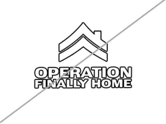
Image of brand logo incorrectly outlined

Do not outline the logo

Image of brand logo incorrectly ordered

Do not reverse the lockup

Image of brand logo incorrectly using gradients

Do not add gradients the logo

>> 04

Color

Consistent color usage strengthens brand recognition, builds trust, and creates a cohesive experience across every touchpoint. While primary colors serve as the core visual foundation of the brand, secondary and tertiary colors have been selected to support and enhance the palette—adding flexibility, depth, emphasis, and visual interest without overshadowing the primary identity.

Primary Palette

Gold Medal

Hex: #FDAF42

Concrete

Hex: #404041

Picket Fence

Hex: #FFFFFF

Secondary Palette

Concrete

Hex: #7A7975

Khaki

Hex: #BEA690

Charcoal

Hex: #2D2E2E

Tertiary Palette

Lumber

Hex: #6E5439

Steel

Hex: #BAB8B0

New Lawn / UI

Hex: #00000C

Patterns

Charcoal & Slate Chevron

Camo

>> 05

Typography

A typography system to provide a clear hierarchy and structure, ensuring every message is legible and reflects the strength of our brand.

Primary Typeface

Secondary Typeface

Lato

On the Web
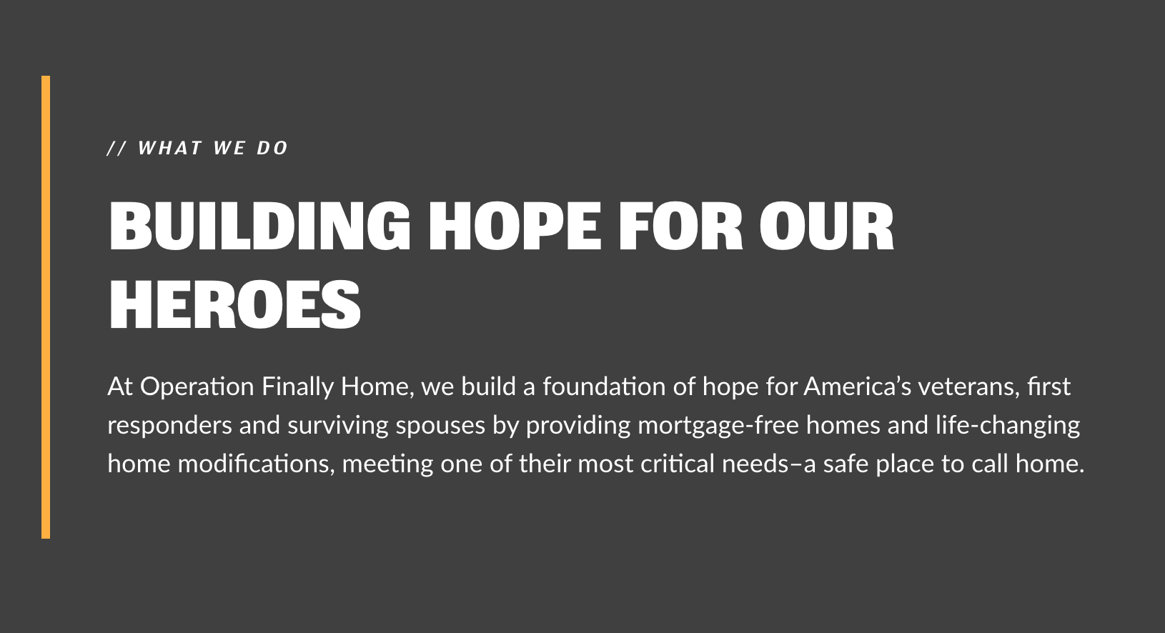
Text Lockups

Metric Cards

>> 06

Art Direction

The greatest way to show gratitude for service is to ensure the life that follows it is lived in full color. Our photography should feel active, not archival.

By utilizing high contrast and a vibrant, saturated palette, we visually signal the transition from the uniform to the individual bringing the “human-ness” of our

families into sharp focus.

Contrast

Favor deep charcoal and bright whites. This adds “weight” to the image, honoring the strength of our heroes. Avoid “flat” lighting.

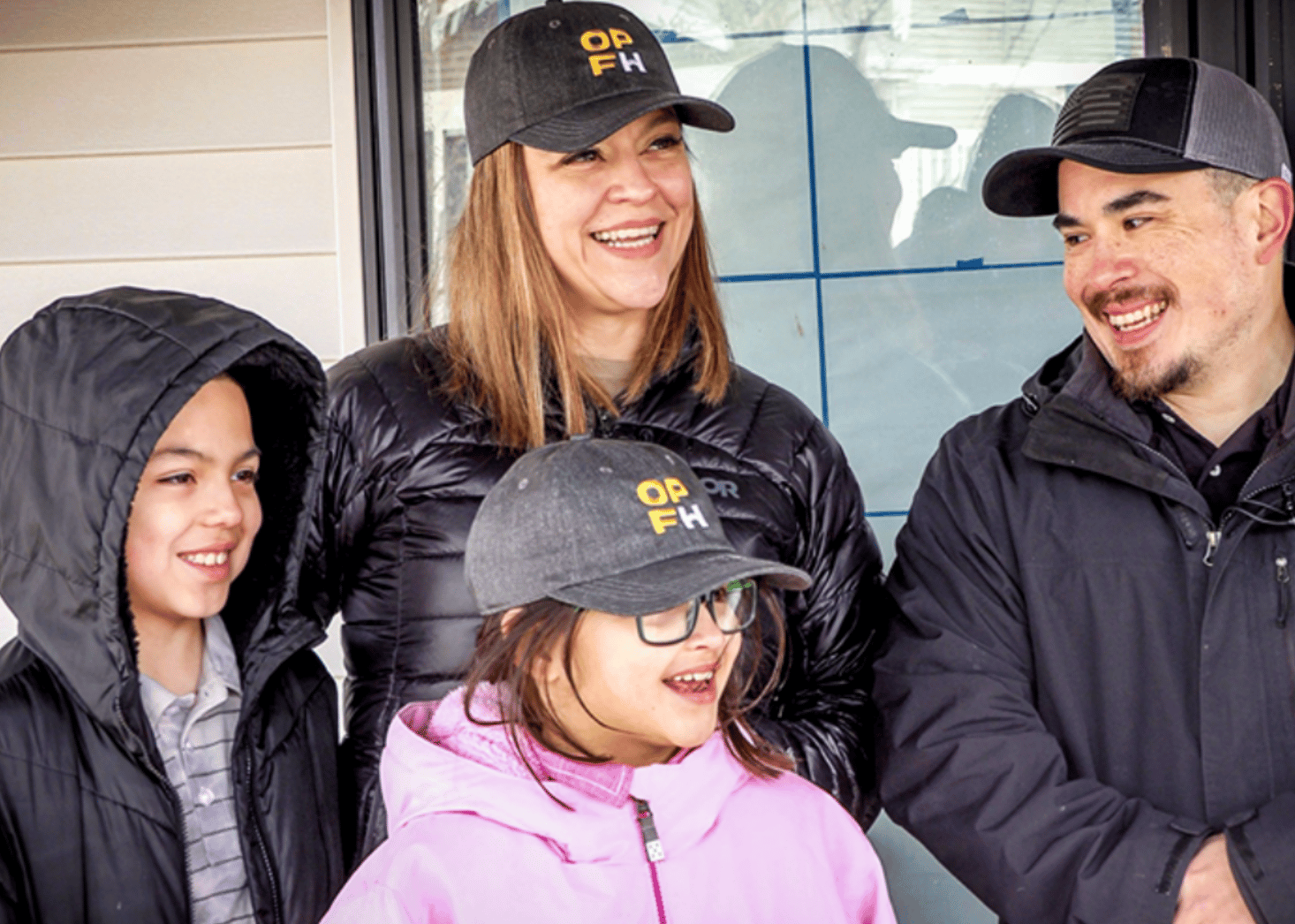
Saturation

Boost the warmth ever so slightly. We want skin tones to look vital and landscapes to look lush. Color is our proof of life; it’s how we show that the “gray” of transition has been replaced by the “vividness” of life at home.